Response-ish Web Design
Two BBC News codebases are not better than one. But until the responsive site is finished the desktop site can’t be retired. Read on to find out how Responsive Web Design is being used to keep both sites up to date.
While not strictly about responsive web design, this post is about the strategy of how we move away from a large legacy site to a fully responsive one.
About that “mobile only” responsive website of yours
Since the launch of our responsive website in March 2012 there has been one consistent criticism leveled at us: its not actually responsive. How can it be responsive, people say, when it sits on an “m” dot sub domain while the old site still exists and takes most of the traffic?
If you think we would welcome this kind of criticism as enthusiastically as Piers Morgan being welcomed at a NRA rally, you would be wrong. We actually agree, we currently do have a mobile only responsive website.
When the mobile site first re-launched it was opt in only, we redirected traffic from our old mobile URL (http://www.bbc.co.uk/news/mobile/) to the “m” dot subdomain (http://m.bbc.co.uk/news). Jo Public had to be a current user to know the URL, so it was just for devices that we classified as “basic phones”. Towards the end of last year (2012) we felt the site was good enough to make it the primary experience for smart phones, i.e. iPhones and Samsung Galaxies, so we started automatically redirecting those phones from the desktop site to the mobile one.
Sometime this year we will start redirecting tablets to the responsive site, and then hopefully towards the end of the year we will make the responsive site the default version you see on any device. The plan is for the desktop site to always exist for historical reasons – each story we publish is a public record of fact – but eventually we’ll stop publishing to it and all new stories will only be available on the responsive codebase.
Content parity
Since the launch of the responsive site all of our efforts have been in giving it content parity with the desktop website. The desktop website is really big, it has loads of really interesting content, like image galleries, audio slideshows, interactive panels, timelines and infographics that are not obvious how we make responsive.
The problem we have now is that while we’re trying to make more existing content responsive, the editorial teams want new features for the existing desktop site.
This is an issue.
Planting a seed
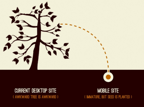
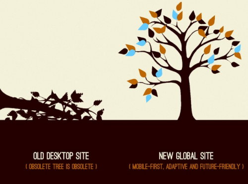
At the 2012 September Breaking Development conference in Texas, Brad Frost presented his talk “US Presidential Smack Down”. During his hour on stage Frost compared the BBC News mobile and desktop sites to how you would replace an old tree with a new one.

The new mobile site is like a planted seed…

… It will eventually grow into a full responsive product that will replace the desktop site.
Frost correctly hypothesized that we are slowly growing the mobile site into a fully-fledged responsive product to eventually take over and replace the existing desktop site.
The desktop site is still built using the same technologies as when it was first released in 1997. The site is made up of millions of statically published files. Each URL is a combination of certain files, rendered together using Apache’s SSI & Velocity technology. This static platform is basic compared to modern day web publishing solutions, however it is very fast. It was built this way so it could withstand the high levels of traffic BBC News receives.
> Andrew Orlowski’s article “Scoop! The inside story of the news website that saved the BBC” tells the story of how the BBC News website was created. It’s a really interesting story and I recommend that you read it.
The responsive website is very different. It sits on a dynamic platform with a PHP rendering layer. Each response includes a call to our service layer. Varnish sits between Apache and the outside world to keep responses cached. The new platform’s strength is the ability to provide services rich in content and functionality.
The two platforms are very different; for us, developers it is not straightforward for us to create new functionality for the responsive codebase that can also be used on the current site. When we get asked to create new functionality, like adding updates from a live event page onto an index page, we want to do it using the new codebase. The new codebase is better structured, better tested and more functional, it is also hosted on GitHub, so has Gangnam Style [Ed Note: Please never use this reference again].
Despite the new functionality existing on the mobile site, we still need to make it available to users of the desktop site. “How do we do this?” I hear you ask, with the use of wormholes!

Only joking, we really use proxy passed SSI includes. “Wormholes” is how we explain it to the non technical, easily impressed management peeps (HTML5? WOW!!!) here at BBC News.
As a concept, using proxy passed endpoints to tunnel content into the old site works really well. It gives us the ability to carry on maintaining the desktop site while building new functionality using only the responsive codebase. However this idea does bring with it some unique issues: we’re now building HTML, CSS and JavaScript that has to work within two completely different clientside environments: different HTML structures, different CSS style guides and resets, but hardest of all we need to make our JS modules work with two different sets of JS dependencies. This is why we recently replaced our dependency on Ender for jQuery 2.0.
Hail to the chief
In November 2012 BBC News covered the USA Presidential Elections. The coverage was available on the responsive website, the desktop website and also 27 international language versions of BBC News. It was a custom built application, hosted on the responsive codebase using the wormhole strategy to provide content for the desktop site.
At the beginning of May 2013 BBC News then covered the British local elections. Again the coverage was provided by the responsive codebase but also delivered to the desktop site.
These applications were built in a modular fashion, with each module being made available on its own endpoint. Pages on the responsive website were built in a regular way, with a standard single response built from these modules at the PHP layer.
But for the desktop site, Apache takes collections of these modules rendered from the responsive site that are proxy passed through and added together before sending a combined response. Mixing and matching responsively-made modules allowed us to reuse some modules in ways we never thought about.
The USA elections banner that spans across all the pages was also used as the promo for the desktop homepage. Because it could shrink down (its mobile first, so technically its expanding up) we were able to position it anywhere the journalists wanted and it just worked.

The election banner appears across the top of the US Elections coverage page…

… which was also used as a promo for other pages
Likewise for the British local elections, the HTML table listing the councils won by each party was also responsive, so we used that as a promo for the homepage too.

The responsive HTML table was used as the first piece of content you saw for the UK local election coverage in May…

… and because it was responsive, it could also be used as a promo for the News homepage
> Technical note: We make content in each break point scale up to the bounding width. Even though the width of the desktop page didn’t match a break point, we used Sass to pull out the relevant media queried CSS to create a desktop stylesheet.
New News
The first year of the new BBC News site was about making a great core experience. We figured out what the correct ingredients were for building a website that will take BBC News into this new world of massively diversified client devices.
2013 has been all about pushing RWD into the nooks and crannies of the site, finding out how to make more complicated content mobile first while also creating new features for both the mobile and desktop site. We might not get to the desired result of a fully responsive website by the end of the year, but everything we make from here on in is definitely going to be responsive-ish.