Tables
The previous post Response-ish Web Design explained how we are slowly gaining content parity between the responsive and desktop websites. We’ve recently started adding tabulated data onto the responsive site. Its hard to do, here’s how we’ve done it so far.
When I say hard, I don’t mean “Chuck Norris” hard, as there are plenty of examples showing you how to do responsive tables. I mean “Kick-Ass” hard, as no matter how many times we break the problem’s legs it keeps getting back up to tap us on the shoulder and pick another fight.
Where’s the bazooka?
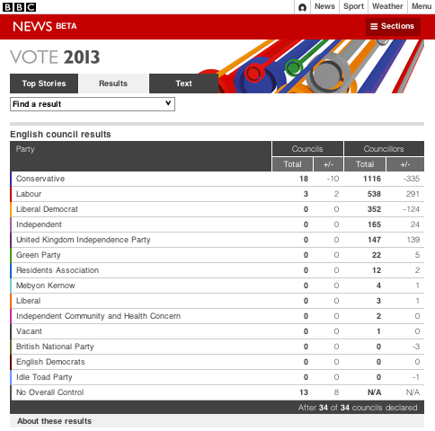
For the 2013 local elections coverage we added tabulated data to the reponsive site for the first time. One of the data sets was a collection of political parties, the properties of each party was:
- Party name
- Councils won
- Change in councils percentage
- Councillors won
- Change in councillors percentage
The best responsive table example I found was made by Aaron Gustafson, so I started off by copying that. Aaron very cleverly changes the table into a definition list when the screen gets too small to display the table.
This is done by changing each <td> into a block level element, then using the value in a data property as a definition title. The first column in the row is the party name, this acts as a sub-header within the definition list.
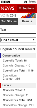
Its a really clever, pragmatic way to get the table to display as a definition list. As the table shrinks down to change into a definition list, it means the CSS pseudo element and pseudo content styling is placed in a media query, so legacy IE browsers don’t need a polyfill or alternative solution.
This isn’t “mobile first” so our immediate concern is that it is a #RWD anti-pattern. The semantic structure of the content is tabular, so the HTML should be written as a
<table>. Tables have their presentation baked into their semantic meaning, so this means the only way we can add tables to a #RWD page is if we make the initial state of it as wide as the content needs to be.
Additional break points required
The only issue I found with Aaron’s implementation was that its limited to just two states: the definition list and the table. Because there were five columns in the table the break point for the definition list is set from 0 to 600px. A 600px wide definition list doesn’t make the best use of the space available, so I added in an additional break point from 241px to 600px.
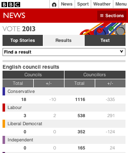
241px to 600px break point
I made the first column act as a sub header with the table, making it look like a seperate row that spans the other 4 columns. This breaks the layout of the table though, as the <td>s no longer align with <th>s in the table header.
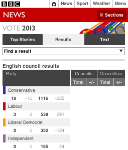
Setting display: block; on a td will move that element out of the table structure, breaking the presentational alignment.
To fix this I replaced the table header, hiding it offscreen (using absolute positioning instead of setting “display: none” for the sake of screen readers) and adding in a fake header using JavaScript. Empty <div>s are added into the page and populated with the column names using CSS pseudo content (so screen readers do not get the header read out to them twice).
“WTF are you supposed to be? The green condom?”
When we first showed this to our management they were pleased. They thought we had a solution for putting tabulated data onto the responsive website. However the problem isn’t that simple.
This solution works because of the structure of the data. Each row has an obvious sub header: the party name. This solution could be used for other similiarly structured data, but not all tabulated data that we display on the desktop site.
Making responsive web design work with content that comes from a CMS is hard. Making small sites is simpler, as you are able to build custom solutions for data in a limited set of pages. But with a CMS you need to apply patterns that any data can fit into.
Because of this, CMS’s will need to improve previewing for specific content types, and maybe give the user different layout options for them. As a technologist the worst thing you could do in this situation is to limit the type of data that the user can make. If the technology is dictating the content, then you’re doing it wrong.
By Tom Maslen @tmaslen