Building a responsive SVG map
Visualising data is fun. Visualising election results in real time – especially so. For the 2014 local and european elections, we wanted to build rich visual components that tell the election results in an easy to understand way. One of those visual components is a fully responsive map, built with SVG. We learned a lot building it so wanted to share with you some information about how we did it.
At the BBC plenty of online election maps have previously been built in Flash, but that format no longer meets our needs for serving our content to multiple platforms. We started using static SVG for maps during the 2013 local elections. With 161 councils up for election this year (compared with 34 last year), our maps got more complex – so we needed to add a layer of interactivity to our maps to allow users to explore the results at a more granular level. Getting the performance right was also a big challenge.
Pro tip: Make it light, lighter, and lighter…
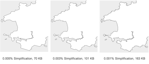
One of the advantages of using SVG as a map is that it’s vector based, so it can scale to any viewport without losing detail. The downside is that the file size can vary dramatically depending upon the detail of the boundaries.
Similar to our responsive images, we wanted to create multiple versions of the SVG map at different levels of detail, and decide which map to use at run time. This means desktop users get the most detailed map, and mobile users will see less detail but the page will load faster.
There are many open source tools for ‘shapefile’ processing: QGIS, PostGIS, MapShaper… Despite this, simplifying a shapefile while maintaining shared boundaries remains a difficult task. Chris Henden’s BBC Location Services team in Cardiff took up this challenge and provided us with some really satisfying results:
With three sets of assets for the map in the mobile, tablet and desktop views, we can load the suitably sized version into the browser, and draw the shapes in SVG. We chose D3.js to handle the SVG generation and interaction as it provides a simple yet powerful API.
Let there be colour
After we have the geographic information for the council regions in the map, the other data we need is the election results for each council.
The fast and reliable results data comes in from our election results system – a cloud-based application, built by Steve Wheeler’s BBC News data team and Robert Kenny’s BBC News framework team. The system pushes results to a component service using Amazon SQS and SNS, the component service layer renders HTML or JSON which drives all the election results data in our sites including promos, tables, lists and the map.
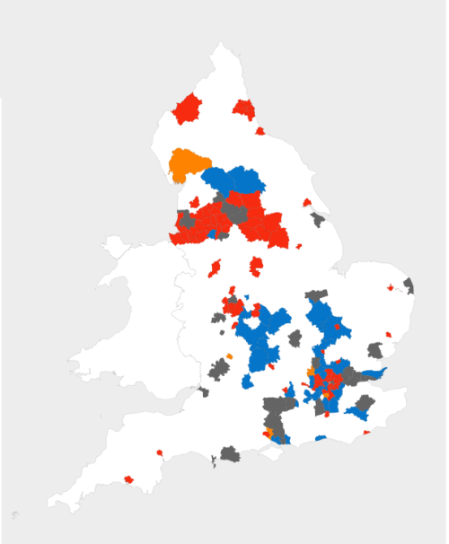
Once the map component has the election result JSON data, we use JavaScript to iterate through the results, finding each boundary in the map by GSS ID (unique identifiers used to represent geographical areas in the UK), then a CSS class representing the winning party will be added to the SVG path. So now that the map combines geographic data and results data, it starts to become meaningful.
All party colours are stored in a Sass collection, which allows us to define a party colour once and generate all the party colour related styles cross the Vote2014 site.
The national view after all results are declared:
Zooming & panning
Because of the fine detail in our maps, we wanted to add the ability to zoom into and pan around the map. SVG can be zoomed easily using the SVG transform attribute – which is similar to but also a little different to a CSS transform. We used the D3 Zoom Behaviour API to handle event listeners to for both mouse and touch gestures. The API also gives us position information which we can feed into the SVG transform attribute.
The problem we found with an SVG transforms, is that while they worked well on desktop, the performance on mobile was atrocious. So, we tried a different approach which was to use hardware accelerated CSS3 transforms.
CSS3 transforms are a separate implementation from the SVG transform attribute, but they have common features. Both have translate and scale, but the ‘transform origin’ is different – for HTML elements the default transform-origin is the centre of the element: transform-origin: 50% 50%, whereas for SVG elements the transform origin is relative it its bounding box: transform-origin: 0 0. So to make our CSS transform behave the same as the SVG transform, we need to set a consistent transform-origin. Here are some images which demonstrate the difference:
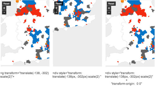
By animating the SVG container element with CSS3 instead of using an SVG transform, we found the performance to be significantly faster on mobile devices.
There is only one small problem on webkit browsers with using CSS3 for animation via zooming or panning, which is that after the animation is complete the SVG image gets blurry. It turns out however that there is a quick fix, which is to force a redraw of the SVG element once the animation is complete. Certain style updates to the SVG element will force a redraw – we took the CSS transform that was on the map’s HTML container, and placed it on the SVG element itself – this triggers the redraw which ensures a crisp image at the end of the animation.
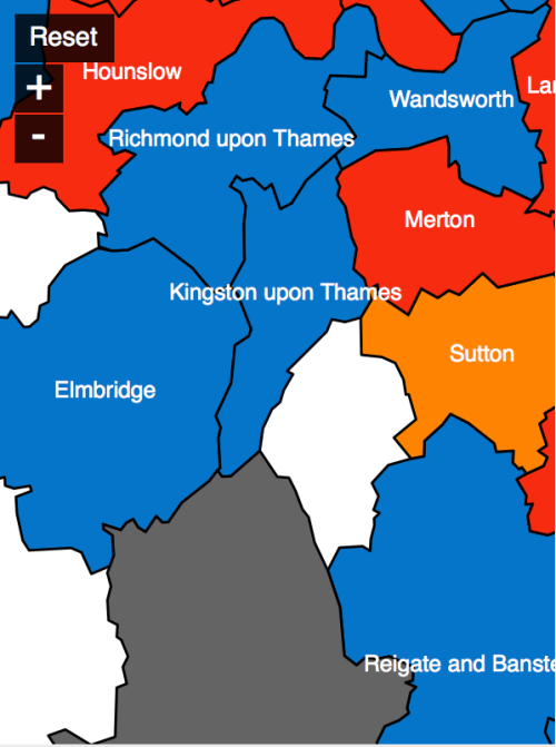
Labelling
No map would be complete without labels. Users need to know which area they are looking at, and how and when to display council names is probably one of trickiest problems we had. At the most zoomed out state, there are simply too many councils to show all labels. Some solutions to this problem included:
- Only show labels when a user hovers their mouse over a council. This will give user instant feedback but it wouldn’t work on mobiles.
- Show labels in a overlay when a user clicks a council. Again this wouldn’t work well on mobiles and it also creates an extra step for users.
- Show labels at an ‘appropriate’ zoom level. Where ‘appropriate’ means that labels wouldn’t be too cluttered.
We went with option 3. To do so we have to work out the densities of the councils, so as to only show labels when there is sufficient space to avoid labels overlapping each other. To calculate the council density at different zoom levels, we used the getBoundingClientRect() method to get each polygon’s position, then compared these with the viewbox, thus telling us how many polygons are visible on the map. Each polygon represents a council area, so this gave us an idea of the density of the map at a given zoom level, and thus whether or not to display the labels.
And here’s the end result!
It wasn’t just maps…
Responsive design remains challenging as we strive to bring richer experiences to our users. Producing robust data driven visual components with varying shapes, formats and behaviours is hard, but it’s also rewarding and fun at the same time. Working closely with our senior designer Audrey Rapier, my colleagues Sam French and Peter Guntrip have created some really interesting responsive components like the hemicycle and animated election banner.
We hope that by crafting clean and high performance UI we give users the freedom and enjoyment to explore and make better sense of the election results. Checkout our Vote2014 site and let us know what do you think.
By Tian Yuan