Responsive infographics workflow: the “datapic”
We changed our workflow for producing small infographics, making them quicker to create and output responsively. Here’s how we did it.
You may have noticed a familiar pattern emerging in how we present data visually…
http://www.bbc.co.uk/news/magazine-23448846
Sometimes, we have information that is worth reading about but doesn’t fit particularly well into the story body itself. Rather than our journalists artificially filling out the story with paragraphs just to get the figures across, we want to present this data in a visually engaging, meaningful way.
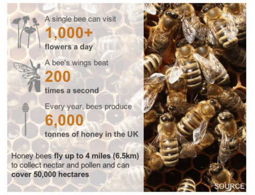
The original “datapic” format was for the “Who, what, why: How do you track a honey bee?” story. Our designers came up with a way of delivering snippets of somewhat unrelated information in a responsive design.
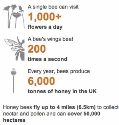
“Bee graphic” datapic, as seen on mobile
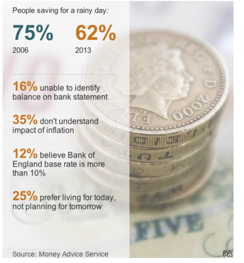
It wasn’t long before a similar infographic was commissioned- this time for the “Millions of Britons financially ‘illiterate’” story. The design was strongly based on the earlier datapic, albeit without the icons.
http://www.bbc.co.uk/news/uk-23548745
Some designs move away from the original bee graphic quite a bit, but the fundamental markup stays roughly the same- a container div with background image, and an inner div with slight transparency containing related text and/or figures.
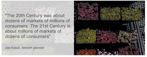
“Quote style” datapic, full view
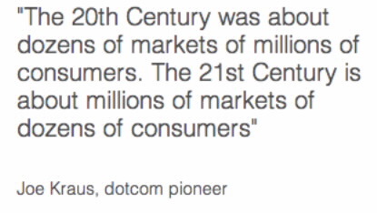
“Quote style” datapic, mobile view
http://www.bbc.co.uk/news/magazine-23990211
It was clear that a pattern was beginning to develop – something that could potentially be templated to increase efficiency and decrease the time to deliver.
Please, God… make it stop!
The growing popularity of the datapic format became something of a burden on our resource-stretched developers. What was initially a bespoke one-off feature became a regularly commissioned standard.
At its peak, we were developing up to five datapics a week. Even when developing these from a template, the designs were usually subtly different enough that they would still take 2-3 hours to develop.
We software engineers shouldn’t be wasting hours tweaking CSS and HTML. We should be doing magical things, like RESTfully data-mining mobile scalable big data… in the cloud.
Not to mention that one of the most time consuming aspects about developing datapics was the back-and-forth contact with the designers: communicating color codes, font families, pixel-perfect padding, and other alliteration-rich CSS.
We realised that, though the skills for developing such features lay strongly in the developers’ camp, the design and responsive behaviour was under the complete creative control of the designers. If only there were a way of putting designers in the driving seat without them having to get to grips with CSS…
The Template
I’d been using a SASS template to increase my own productivity in developing these datapics. It got to the stage where I populated much of the datapic using SASS variables… something which designers ought to be able to do too.
Our datapics have roughly this structure:
<div id="unique_datapic_id" class="classes required to fit nicely in the BBC template">
    <div class="outer_wrapper">
        <div class="inner_wrapper">
            // HTML content - headers, paragraphs, lists, etc.
        </div>
    </div>
</div>
The “outer_wrapper” class has a background image, which is only displayed if the screen is at least a certain width.
The “inner_wrapper” class is a slightly transparent, white background covering a portion of the outer_wrapper’s background image. Nested inside this div is our content-specific HTML.
Using SASS, we can define variables that will change from datapic to datapic.
$unique_datapic_id:  UNIQUE_ID;
$background_img_url: "http://bbc.co.uk/example.jpg";
$sprite_img_url:     "http://bbc.co.uk/example_sprite.png";
$header_color:       #CF0000;
$default_color:      #333333;
// etc
We can then reference these variables throughout the SASS file- SASS will automatically replace a reference to a variable with that variable’s value. All a designer would have to do is tweak the values of these variables and update the unique ID in the HTML.
Defining a workflow
Although editing variables in a SASS file is pretty straightforward, even the most enthusiastic designers would baulk at the mere thought of having to download and install a SASS compiler- and run it from the command line- as part of their daily workflow.
What we needed was a simpler solution, ideally with a sexy GUI interface that allows designers to tweak their SASS and see their changes instantly in a preview window.
Tian Yuan, @tnyuam, one of our senior developers, suggested looking into Codepen. It looked very promising – we were able to define our template “pens”, which take SASS and HTML input and render a live preview in another frame on the page. The frame can even be resized so see how the output behaves responsively. Designers could fork our pens and make minimal, simple tweaks, before exporting their designs as a .zip file and giving it to the developers to package up and make live.
However, hosting company assets (images, etc) on a third-party service, accessible to the whole world (if you know the URL), is risky territory. We needed an offline solution if we were ever going to get through the red tape.
On Steven Atherton’s (@tarqwyn) suggestion, we opted for a desktop program called Brackets, which does much the same thing as codepen.io, only offline.
Designers can import projects into Brackets, tweak their CSS, and automatically render a live preview in their browser using a local server bundled with Brackets.
Notice anything odd about the above paragraph? I said CSS, not SASS. I may be writing this at 2am in a flat devoid of coffee, but that wasn’t a typo. At the time of writing, there is no SASS support for Brackets.
Luckily, there is a Brackets plugin available that supports the next best thing: LESS. Though slightly less feature rich than SASS, LESS still lets us use arguably the most important of all development principles: variables.
Going forward
…and other such management speak. With a workflow beginning to come together, some organisation was required to ensure that the new datapic-creation process wouldn’t fall apart in its infancy.
Myself and senior designer Helene Sears (@MateerS) negotiated three main templates designers should stick to, with the option of constructing more templates in the future should the need arise.
We opted for:
- Datapic with listed information and icons (AKA: the “bee” graphic)
- Datapic with listed information and no icons (AKA: the “finances” graphic)
- Datapic with quote
After developer Richard Bangay converted and fine-tuned the above templates into SASS, and after we all decided upon a clear workflow, we held a couple of tutorials which were attended by the Visual Journalism design team, as well as a few interested journalists.
Now we’re at the stage where even the journalists are able to create responsive datapics, with minimal designer/developer intervention. Our first non-developer-produced datapic went live recently.
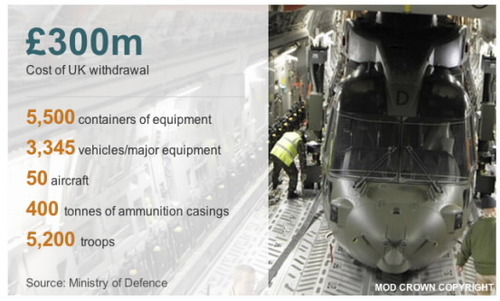
http://www.bbc.co.uk/news/world-south-asia-25848662
This also serves as a pretty cool article snapshot for social media purposes:
Back in the day, datapics would be straight graphics; pure images that:
- Are inaccessible, apart from what is provided in the alt tag
- Do not scale well on mobile devices
With the HTML representation of datapics, such features are now fully responsive and accessible, as well as cutting down on the page weight- images without text grafted onto them don’t need to be quite as hi-res.
Even better is that we no longer need the services of a web developer to create a web-friendly infographic.
Chris is currently working at BBC News as our 1 year work experience web developer. There are other roles currently available in the News development team: