Cutting the mustard
The browser is a hostile development environment and supporting a wide range of desktop browsers can be tough work.
One of the immediate challenges we discovered when we first started the responsive news prototype was the large range of devices that we would have to support. It terrified us. This article is about a solution we use to alleviate this problem.
Stats and market evolution
Looking at mobile devices that are accessing our service in the early stages of our project highlighted the challenge. We have ~80 significant browsers / operating system combinations regularly using our application across the globe and a long tail of hundreds more. In the four months since we first gathered the statistics there’s been many more releases and updates – Amazon’s Fire, Apple’s new iPad, Ice Cream Sandwich, Microsoft’s Mango.
To support everything on desktop we typically have to test a dozen different browsers with a multitude of different configurations and subtle differences between major and minor version numbers across three operating systems. But developers are used to this, we have coping strategies – multi-browser installs, virtual and remote environments – and it’s a fairly well trodden ground.
Responsive development stretches the problem further by introducing a more fragmented market across more axes. We have no multi-browser VMs available, we can’t remotely test a tactile UI, testing how your interface reacts when a phone enters a 3g network black spot is tricky.
To that extent creating complex UI for the number of devices that significantly trend, say, user agents with a greater than 0.5% share of our audience, of bbc.co.uk/news is impossible. IMPOSSIBLE! There’s just too many of them.
Another factor that makes developing for responsive design hard is the rate with which mobile users update their phones and browsers.
In the developed world the typical contract length for a smart phone is between 18 months and 2 years so there’s a fairly quick upgrade cycle from year to year. A good proportion of the market that will always be using the latest technology and expect the latest/greatest experience. Conversely, the other half of our audience are using low-end devices, some developing economies appear to be using exclusively Nokia phones (usually running Opera or the native s40 browser), a trip to your local phone shop will highlight that manufactures are still pushing a vastly different set of phones to their customers.
So this is the conundrum of our project from a technical perspective. How do we continue to support the vast number of older and less capable devices while delivering to our brief of creating a world class news experience tailored to smart phones and larger resolutions?
The answer for us is a two-tiered responsive solution.
Creating a core experience
We make this manageable in the same you and everyone else in the industry does it: by having a lowest common denominator and developing towards that. So we’ve taken the decision to split the entire browser market into two, which we are currently calling “feature browsers” and “smart browsers”.
Someone on the team started referring to them as “HTML4 browsers” and “HTML5 browsers”, which we find is easier to communicate the sentiment to non-technical people.
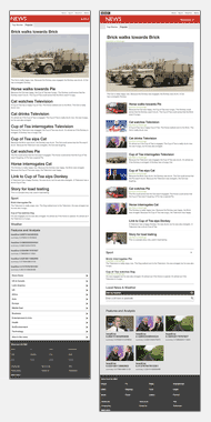
The first tier of support we call the core experience. This works on everything. I’ve seen it work on a Nokia E65, a Blackberry OS4, Kindle 1, a HTC Touch 2 running Win Mobile 6.5, a Samsung U900 Soul, a Commodore Vic20, my nan’s slipper and a toaster just selotaped to a TV. Likewise, GoogleBot, text-browsers like Lynx, folks that disable JavaScript and so on are all assured a good level of service.
The USP of the core experience is its speed. Our front page makes 1 request for the HTML document, a request graphic associated with the first story, then 2 CSS requests, a stats web bug (a GIF) and 2 branding images – 7 request in total, at approximately 21kb. Everyone gets this initial payload.
By comparison, our current wide-screen targetted desktop site currently measures in at ~500kb and 77 requests without javascript and ~700kb and 113 requests with javascript.
On top of this we layer our JavaScript application. Each page has a block of inline JavaScript that checks the capabilities of the browser before deciding whether to kick start the enhanced experience. Progressive enhancement, really, at heart. The JavaScript will include curl.js into the page and then AMD modules will load additional functionality into the page (our drop-down section navigation for example). The USP of this UI is that it provide a news service that tailored to new hardware/software.
Mustard
In previous projects across the BBC this split has been phrased in user agent terms. We pick IE6 as the minimum entry point and coerce, hack and shoehorn our code to fit that requirement. But these days, with such a long tail of user agents now accessing the site, this becomes a fruitless exercise. Feature detection is the obvious solution.
The single line of JavaScript that decides whether or not the browser is HTML4 or HTML5 is this:-
if('querySelector' in document
     && 'localStorage' in window
     && 'addEventListener' in window) {
     // bootstrap the javascript application
     }
As the application loads we earmark incapable browsers with the above code and exclude the bulk of the Javascript powered UI from them, leaving them with clean, concise, core experience.
Here’s the justification for each condition:-
- document.querySelector – A large part of any JS library is its DOM selector. If the browser has native CSS selecting then it removes the need for a DOM selector. QuerySelector has been available in Firefox since 3.5 at least and has been working in webkit for ages. It also works in IE9.
- window.localStorage – Although we are not using it yet, we are planning on making considerable use of it. Imagine that if you first came to the mobile site we downloaded all the stories straight away and stored them in localStorage. They’d then be available to use while you are going through an areas of sketchy bandwidth.
- window.addEventListener – Another large part of any JS library is event support. Every browser made in the last 6 years (except IE8) supports DOM level 2 events. If the browser supports this then we know it has better standards support than IE8.
So what do you think of this? Mocking me is possible via the comment form at the bottom of the page. This hopefully isn’t too controversial, both Lanyrd and Mantra have recently launched mobile products that do a very similar thing. This test effectively breaks the web browser market into these two groups:-
HTML5 browsers:-
- IE9+
- Firefox 3.5+
- Opera 9+ (and probably further back)
- Safari 4+
- Chrome 1+ (I think)
- iPhone and iPad iOS1+
- Android phone and tablets 2.1+
- Blackberry OS6+
- Windows 7.5+ (new Mango version)
- Mobile Firefox (all the versions we tested)
- Opera Mobile (all the versions we tested)
HTML4 browsers:-
- IE8-
- Blackberry OS5-
- Nokia S60 v6-
- Nokia S40 (all versions)
- All other Symbian variants
- Windows 7 phone (pre-Mango)
- …and many more that are too numerous to mention
I call the test that determines what group a browser belongs to cutting the mustard.
Brave new world
As a web developer “cutting the mustard” provides me with an opportunity to wipe the client-side development slate clean and start afresh. Over the last few years I feel that our industry has gotten lazy because of the crazy download speeds that broadband has given us. Everyone stopped worrying about how large their web pages were and added a ton of JS libraries, CSS files and massive images into the DOM. This has continued on to mobile platforms that don’t always have broadband speeds or hardware capacity to render complex code.
With our mustard test we can now develop JavaScript solutions that use native implementations of features that we have grown accustomed to using without having to download polyfilling libraries.
The increasing popularity of mobile web browsing, and the availability of responsive web design has forced my team to refactor how we think a modern webpage should be built.
Our product is the future of BBC News online. It’s responsive, works on everything, looks great and is very fast.