Fluid grids, orientation & resolution independence
If you’ve spent any time building responsive websites with fluid grids, you will have encountered the shock of seeing your beautiful portrait layout distort when viewed in landscape mode (or vice-versa.)
Load up this example page on an iPad and change the orientation to see the problem, or just check out the screengrabs.
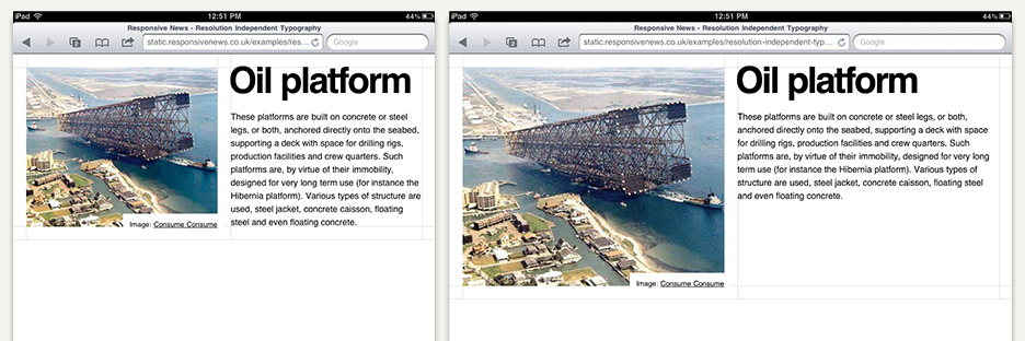
This happens because whilst the layout and embedded content (images, video etc) are sized in relation to the pixel width of the viewport, the typography is not. And whilst it isn’t too difficult to design with enough affordance for the variation caused by the iPad’s 4:3 aspect ratio – most (if not all) Android tablets have 16:9 displays. These screens make the orientation difference even more pronounced.
On the landscape 16:9 display our example page looks dreadful. There’s more internal whitespace inside that article than there is content, changing the hierarchy of the page significantly.
We could patch the issue by adding a load of additional media-queries and styles, but I don’t think creating endless design variants for minor screen-width differences really solves the problem. It’s also getting a bit close to designing for specific devices, whereas our goal with responsive design is to design for interaction behaviours (eg; design for ‘tablets’, not ‘iPad’.) We should be able to create a single method of storytelling that works for all tablet-sized devices without having to constantly rework details to account for new form-factors.
Create solutions, not problems
I want to use media-queries to switch between interfaces for ‘mobile’, ‘tablet’ and ‘desktop’ viewport ranges so that I can provide appropriate information density and linearity, and then have those interfaces scale to fit individual form factors. The fluid grid works precisely this way, so what we’re looking for is a way to make the typography similarly scale in proportion to the grid.
By specifying our font sizes in ems we can adjust every font-size on the page by using media-queries to change the font-size set on the BODY or HTML element according to viewport width:
    @media (min-width: 960px) {
        html {
            font-size: 12px;
        }
    }

    @media (max-width: 959px) {
        html {
            font-size: 10px;
        }
    }
This gives us a starting point – the styles will make your em-specified fonts smaller when the viewport is narrower than 960px – but it’s an arbitrary resizing. I want the fonts to scale proportionally (eg; when the viewport is 50% of the ‘target’ width the grid will shrink to fit that viewport, so I want the font-size to also be 50% of the ‘target’ font-size.) To do this, we need to decide on a ‘target’ viewport width in order to calculate our proportions. To make life simple, I’d suggest using the device you’re designing with as your ‘target’ viewport width (which in my case 768px – an iPad in portrait orientation) so that you get a nice 10px:1em mapping between your font-sizes in Creative Suite and those on the page.
Once I’ve decided on my target viewport of 768px (which I know I want to have a font-size of 10px), I just need subdivide that viewport by 10 to create a set of proportionally-correct font-size ‘bands’.
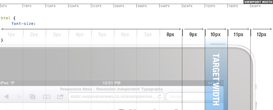
Which looks like this in CSS:
    @media (min-width: 858px) {
        html {
            font-size: 12px;
        }
    }

    @media (min-width: 780px) {
        html {
            font-size: 11px;
        }
    }

    @media (min-width: 702px) {
        html {
            font-size: 10px;
        }
    }

    @media (min-width: 724px) {
        html {
            font-size: 9px;
        }
    }

    @media (max-width: 623px) {
        html {
            font-size: 8px;
        }
    }
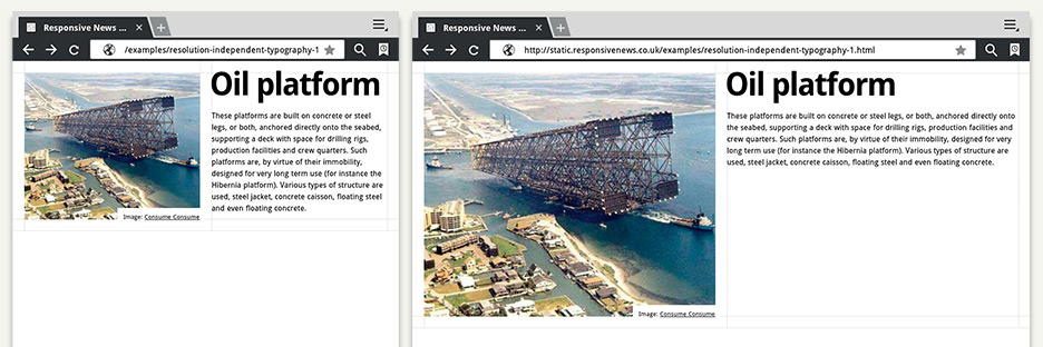
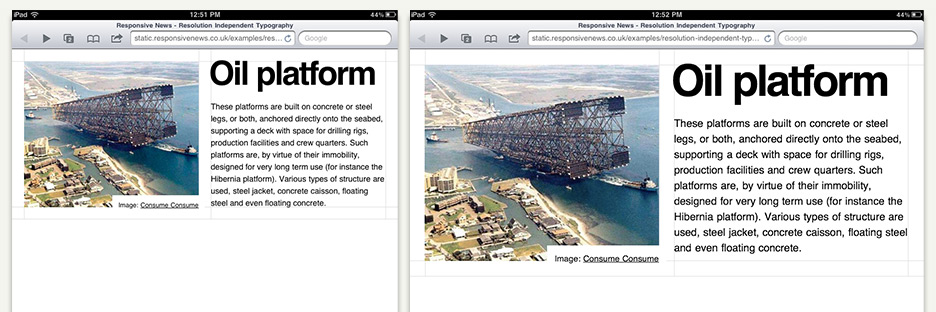
Which works beautifully in principle – but unfortunately we get some scaling distortions due to em sizing being contextual to the font-sizing of any parent DOM element, not just the HTML or BODY elements. Thankfully we do have a better alternative to the em – relative-em sizing – which is contextual only to the HTML element and so perfect for this type of useage. Rem support is pretty much universal on modern mobiles and tablets, and falls back cleanly to px sizing if unsupported.
Check out a revised version of the earlier example page using the technique I’ve outlined above. It should scale cleanly in most modern desktop browsers and tablets.
Examples in the wild
In the last couple of months a few sites have launched using similar approaches.
Browns recent redesign is a horizontal-scrolling site, so they rather brilliantly use the height of the viewport set the base font-size in order to prevent the text from spilling below the scroll area.
A few weeks after Browns site launched, Clearleft unveiled their placeholder site for Ampersand 2012, using the viewport width to set the base em size for the design.
Note. This article is a revised and expanded version of an article I wrote on my personal blog in June 2011.