13 tips for making responsive web design multi-lingual
Responsive Web Design (RWD) builds on the primary design principle underlying the web’s core usefulness and growth: universality. A content out approach that is device agnostic makes your responsive website future friendly as it will in theory work on any device. The web wins the more viewable your website is. By adapting our responsive websites to work with multiple languages we can further increase the number of users who are able to use our content.
The BBC News responsive codebase is responsible for the rendering of 28 different language news websites. BBC Mundo, BBC Arabic and BBC Bengali are just a few of the many different sites all being rendered along with BBC News by our language neutral, bi-directional codebase. This codebase serves 250m users per month. Now that’s a lot of div elements.
When writing a new “responsive” feature, not only do we benefit from the advantages of writing it once and having it work on all devices, but by making it multi-lingual it immediately becomes available on all of our 28 websites. One feature with consistent design and branding across all devices and websites is a huge win for reduced dev and design effort.
Doing this takes a bit of planning up front though. Getting the balance between the uniformity of your sites and the right amount of customization for each one can be tricky. Each language – or service as we prefer to call them – requires a minimum level of localization. This will manifest itself in the design of the site, differences in content requirements and how the interface is built.
From our experience of doing this on a daily basis over the last 3 years, we’ve come up with 13 tips that you can use to help you to achieve this with your own responsive codebase.
1: Don’t confuse languages, scripts and countries with one another
First off it’s important to contextualize what we’re doing. An easy mistake to make with creating multiple different versions of your site is to associate each version with a country. Do not think in terms of the “French” version of your site being intended for France, or the “Russian” version being intended for Russia, as this isn’t necessarily always true. Languages span countries while many countries have bilingual populations so there isn’t a direct correlation between language and country.
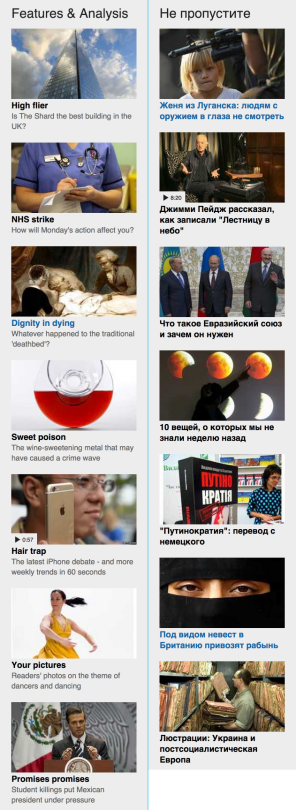
If you are looking to localize your content then think in terms of markets instead of languages. For example the Spanish market might need a different website than the South American market despite both areas having large Spanish speaking majorities. Using the term “market” instead of “country” is more diplomatic too as people’s definition of countries don’t always align. Kashmir, Palestine and Scotland being prime examples of this.
It’s also easy to make the opposite mistake, to associate a country with a language translation of your content. If your intended audience is global and you do not wish to localize your content to a market, then you shouldn’t associate the content translation with a market. An English translation that is intended for all English speakers (i.e. the UK, USA and Australia) shouldn’t make a user click on a UK flag to get at the content.
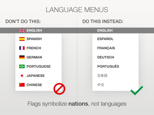
Screenshot taken from https://dribbble.com/shots/1202316-Language-menus-with-flags
It’s also important to understand where scripts fit into all this too. The definition of a script is: a collection of symbols used to represent text in one or more writing systems. I.e. its the written interpretation of a language. Languages can be represented by more than one script, while one script can be used to define multiple languages:
- All Western European languages – English, German and French for example – are Latin based scripts.
- Written Japanese uses 3 scripts: hiragana and katakana syllabaries and the kanji ideographs imported from China.
- BBC News have two different Chinese language websites, one using traditional Chinese script and the other using simplified Chinese script.
Scripts can have cultural and political overtones. Which script you use for a language should depend on your target audience.
Take the Uzbekistan market for example: you may want to use Cyrillic for older audiences and Latin for younger audiences. While for Uzbek minorities outside of the country you may want to use Arabic. This is all due to the political changes the country has gone due to it joining the Soviet Union.
So to summarize our first tip:
- Identify your main requirement: are you localizing the content for different markets or are you providing straight up translations for different languages?
- Make sure you correctly label your use of language.
- Determine the script to be used for each language and make sure you understand any cultural implications this may have.
2: Make each version easily configurable
From here on in I will refer to each version of a site as a “service”, this is to escape the issues explained in the first tip about confusing languages with countries (anyone refering to the Scottish service as “McService” will be asked to leave). Although we are going to have a single codebase to host our multi-lingual website, each version will need to be configurable. We need to store differences between them in an easy to maintain and extendable way. Knowing when to layout a site from right-to-left, rather than the default left-to-right for example, will be informed by each services config file.
Here’s a very simplified and contrived way of explaining it using English and Arabic as examples:
// english.json
{
  serviceName:          'english',
  language:             'en',
  textDirection:        'ltr',
  socialMediaButtons:   ['twitter', 'facebook', 'reddit']
}

// arabic.json
{
  serviceName:          'arabic',
  language:             'ar',
  textDirection:        'rtl',
  socialMediaButtons:   ['twitter']
}
With these config files we’re going to do a number of things:
- Define the webpage language attributes.
- Make decisions about base font properties, for example font-family, font-size and line-height.
- Set the direction of the text: either left-to-right, or right-to-left.
- Differentiate layout for verbose languages.
- Customize content for each service.
For a site to be customized to each service it will require its own CSS. We use Sass to reduce duplication of code. We define components in Sass that is service neutral, then output a separate version of each sites entire CSS.
Contrived example project structure:
config/english.json
      /arabic.json

css/english.css
   /arabic.css

sass/english.scss
    /arabic.scss
    /mixins/_directions.scss

index.en.html
index.ar.html
When processing our Sass files into CSS, it is handy to identify which language we are processing. To help us do this we can define variables within each Sass file like so:
// english.scss
$english = true;
$script = 'latin';

// arabic.scss
$arabic = true;
$script = 'arabic';
A unique variable ($english for example) and the variable $script is defined for each language ($scripts use is explained further below). We could do this another way and define a variable using the same name but assign it different values like this @service = 'arabic';. That is a perfectly legitimate way of doing it, however if you compare how we would conditionally use both of these variable names:
// Example 1 using the variable name $service

@if $service = 'arabic' {
  // apply styling only to
  // Arabic service
}

// Example 2 using the variable name $arabic

@if $arabic {
  // apply styling only to
  // Arabic service
}
You can see that the 2nd example is much more succinct and quicker to read.
With this structure in place we are providing a framework for the rest of tips below to work from.
3: Use a templating language to customize HTML for each service
Even if you are working on static websites I strongly recommend that you use a static site generator. There are many available in all popular programming languages. The BBC News Visual Journalism team even made their own specifically for dealing with multi-lingual versions of content. Using a templating system will allow you to update your entire HTML in one go. You’ll increase the maintenance of your site by seperating HTML templates and service config data.
When writing multi-lingual HTML the first step is to declare the language that the content will be written in and state text direction. Defining the language is simple, add a lang attribute into the html element. To define the text direction add a dir attribute into the head element. With a templating system in place you can pass these values from your config files like this:
<!DOCTYPE html>
<html lang="<%= config.language %>">
    <head dir="<%= config.textDirection %>">
        <meta charset="utf-8" />
        <link rel="stylesheet" href="/css/<%= config.serviceName %>.css">
    </head>
The language code (“en” for English, “ar” for Arabic) is defined and maintained by the IETF (Internet Engineering Task Force). They are standard ISO-639 codes, a full list of them are available on Wikipedia.
It’s important that you don’t get these codes mixed up with the standard for country codes (also available on Wikipedia).
Remember:
- Languages: ISO-639
- Countries: ISO-3166
With this in place you are now ready to ensure all web browsers can correctly display each languages character sets.
4: Create translation files for words that will be hard coded into your UI
An obvious statement to make about building multi-lingual sites is to not bake a language into the templates. This is true for server side and client side code. It’s a good idea to keep lists of translated words for each language you support in “vocab” files that you can conditionally load in.
JSON is a really good format for keeping vocabs in as it is usable by any language and is a lot less verbose and more mobile network friendly than alternatives like XML (YAML is even more terse but not natively supported by JavaScript).
Getting translations created and updated can be tricky though, especially if you have to rely on editorial teams from around the world. Cultural and language differences can be minor but have large consequences, so when dealing with colleagues in other languages make sure to think about the difference in time zones and other technicalities like wars. An anonymous source within our team encountered this problem:
“Once we were waiting for some translations from the Urdu team. We chased them for weeks with no joy. We were about to write an angry email when we found out that the Urdu service was busy dealing with death threats from the Taliban. We decided we could wait.”
There are some external factors even the best project manager cannot solve.
5: Ensure your web font is compatible with all the languages you support
Web fonts are now a standard part of any developers toolkit. Web fonts allow us to set the tone of a site, they are much more nuanced than the standard serif and sans-serif font faces. Most European languages are based on Latin. Web fonts that work with English will more than likely work with other Latin based languages like French, German and Italian (make sure you test your umlauts though). But if your languages are based on scripts other than Latin then use web fonts with caution.
When using a web font you need to ensure all of the characters and glyphs that make up a language are supported. While default system fonts will have excellent support for most non-Latin based languages, we’ve found that we need to use specific web fonts for certain languages.
Services like Font Squirrel, Google Fonts and Type Kit all allow you to test a typeface before downloading it. If you are translating a website from English into another language, and the website uses a fancy web font, you may not be able to use it in the translated version.
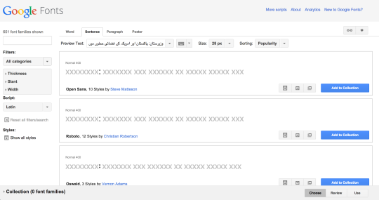
Checking support for the Urdu language in Google Fonts: popular free fonts like Open Sans and Roboto do not have the required glyphs to render Urdu.
You can still use web fonts, but you will need to conditionally load them depending on which service is being rendered into the page.
For some languages it’s actually beneficial for us to use web fonts. The BBC uses its own custom font – BBCNassim – for the Arabic, Persian, Urdu and Pashto languages. Although Arabic is supported by widely available fonts like Arial the other languages are not. Arial is also problematic as it renders Arabic in a very simplified form. The Arial font was invented for the typewriter. Because Arabic is a very complex language (some characters are represented by different glyphs depending on where they appear in a word), the Arial representation of it was simplified to cater for the physical limitations of a typewriter.
These physical limitations have been interpreted into software fonts, where the limitations are no longer a problem. BBCNassim is a much more elegant and elaborate representation of Arabic.
Arial left, BBCNassim right:
While it may be difficult for western eyes to discern differences between these two types, note the obvious difference in rendering of numerals and the difference in character size making Arial take up more space than BBCNassim.
Unfortunately some scripts, like Bangla (Bengalese) and Devanagari (Hindi), still lack support from certain devices. Many of our users will be trying to access these sites using devices that don’t have the capacity to render the web font required to display the language. BBC News caters for this by providing an image based alternative version of Bengalese and Hindi. Every time a page is published from these sites we use an in-house technology called “Kaleidoscope” (chief engineer @jakeDChampion) to take a screenshot of the full page and publish it as a mix of HTML and images.
Kaleidoscope works in the same way that proxy browsers operate. PhantomJS is used to take the screenshot, it renders the page at 240px wide with JavaScript disabled. The image based site is a representation of the standard site in a browser that doesn’t cut the mustard.
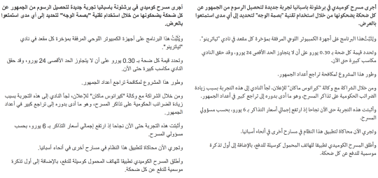
See for yourself, compare the standard Bengali site to the image based alternative.
6: Make your layout language neutral
Depending on the properties of your layout, making it language neutral may not be trivial. Responsive grid systems are quite contentious, and making one with a consistent vertical baseline across all the viewports you have to support is very difficult.
The vertical baseline of a design requires you to use type as a structural element of the layout. Font size and line height has to be deliberately set to components in the interface consistently against one another. Each font renders differently in a web browser, the font size and positioning in the line differs, this is an issue not encountered in the print medium.
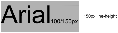
Below is the font Arial as it displays on print and web. Even though they both have 100px font size and 150px line height, they render slightly differently.

A baseline in print defines the vertical space between the bottoms of each line of text.
Screenshot taken from Chivonne Williams website
In a web browser baselines are calculated using the difference between the line height and the font size. When you define a font size, a web browser will use this value to create an “em box”. This em box is the bounding area the browser will render the glyphs of the type into. The baseline of the font will vary in the em box depending on how the typographer created the font. If a font face has large decenders, then the baseline will appear higher in the EM box.
For example, if we were to define our title text like this:
h1 {
  font-family: Arial;
  font-size: 100px;
  line-height: 150px;
}
A web browser would vertically align the text using 17.5px of space above and below, while also adding 15px of additional space below the text baseline to allow for decenders.
Every typeface is rendered by the browser slightly different. If you are never going to change a font face, then you will have an easier job calculating the vertical baseline for your design, but in a multi-lingual site depending on the languages you support your font face will need to vary.
The BBC News and World Service teams update 28 service websites. 15 of these use non-Latin based languages:
- Arabic
- Bengali
- Burmese
- Chinese
- Hindi
- Kyrgyz
- Nepali
- Pashto
- Persian
- Russian
- Sinhala
- Tamil
- Ukrainian
- Urdu
- Uzbek
These languages use non-Latin characters. When rendered into the page at the same pixel size as Latin based glyphs, the characters can become unreadable or get squashed into themselves. This is especially problematic for complex languages like Chinese where you can accidently make the glyphs look like different words.
Because of this, font sizes in your layout need to vary depending on the language. Paragraphs need to be bigger, titles need to be bigger and contrast on smaller text will sometimes require different coloured backgrounds.
This required variance means you will have no consistent vertical baseline across your language sites and so you cannot easily depend on typography as a structural element in your layout.
You could still realign every component against the baseline using different padding per language, but this adds massive amounts of complexity into your code and will in the authors opinion create very fragile CSS.
Instead of trying to achieve a consistent vertical typographic baseline, a better goal would be to achieve the same outcomes – improved visual scanning, cognitive reasoning and understanding of our interface – using a slightly different approach. We can do this by creating a rythm of ratios within our interface, using a cadence of component sizes and spacing between components.
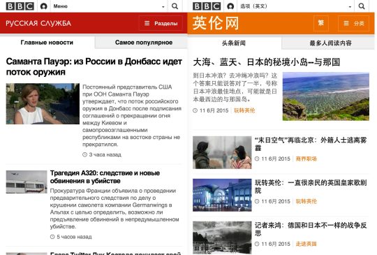
Above: Despite the headline (24px) and the paragraph (14px) being the same on the Russian and simplified Chinese websites, the different in font rendering within each fonts em box means there is no consistent vertical baseline between them.
While we can admit that we will never get a vertical baseline working across our entire interface, we can allow baselines to vary within each component, but still align components against each other vertically as well as horizontally.
The aim to achieve is to create ratios between components on your grid. Consistent spacing between elements of your design can help to create a vertical cadence while still allowing the type baseline within each component to vary slightly.
The baseline will vary between languages.
The web as a medium is inconsistent and completely fluid. Creating a consistent, vertical baseline that is responsive and multilingual is more than likely going to take you too much effort to get value for money from it.
7: Use Sass to create bi-directional layouts
Not all languages read from left to right. Catering for multiple languages often involves having to create layouts that work right-to-left as well as left-to-right. Your design and your code has to be agnostic in this respect. It’s actually easier than it may sound. For example your overall layout should be switchable: main columns floated left with smaller columns to the right, should be able to float right and let the smaller column settle to its left.
Breaking your interface into a suite of components is a good strategy for designing responsive websites. You should already be thinking about how each component works in isolation. Thinking about the UI in this more abstract way will help you to design bi-directionally. You’re essentially holding a mirror up against your design and making sure every component still makes sense when flipped.
When it comes to building HTML/CSS in a bi-directional fashion, this is slightly more tricky, but by using Sass you can quickly adapt your presentation layer to do this. I’m going to show you 3 Sass mixins that we use to help us make bi-directional layouts.
We output a separate CSS file for each service website we make. Each service has a bootstrapping Sass file that sets a few variables and pulls in other Sass files. A slightly contrived example is this:
// english.scss
$english = true;
$direction = 'left';
$script = 'latin';
@include(mixins/directions);
@include(sitestyles);

// arabic.scss
$arabic = true;
$direction = 'right';
$script = 'arabic';
@include(mixins/directions);
@include(sitestyles);
The first line in each file sets the language name. This will be used for setting service specific code throughout our styling (more on this further below). The $direction variable defines the direction of the services layout. The $script variable is described further below. The fourth line includes a mixin described directly below, while the last line includes all of our site’s styling.
Bi-directional property names
There are many CSS properties that we need to consider when creating bi-directional layouts:
- background position
- clear
- content
- floating
- left
- margin
- padding
- right
- text-align
Many CSS property names have the direction defined in the name. padding-left, margin-right for example. To remain left/right agnostic we can use Sass variables instead of hard coding these property names. These variables need to be defined, they also have to be set to the correct value depending on the direction of the layout that we wish to present.
Inside the directions mixin we define all of these variables. We also switch them depending on the value of the $direction variable defined in the file requesting the mixin. For example…
// directions.scss

$margin-left: margin-left;
if $direction == right {
  $margin-left: margin-right;
}

$margin-right: margin-right;
if $direction == left {
  $margin-right: margin-left;
}

$padding-left: padding-left;
if $direction == right {
  $padding-left: padding-right;
}

$padding-right: padding-right;
if $direction == left {
  $padding-right: padding-left;
}

$left: left;
if $direction == right {
  $left: right;
}

$right: right;
if $direction == left {
  $right: left;
}
When applying horizontal padding, margin or horizontal positioning a BBC developer writes for the English version of the site by default. For example to set spacing on a navigation element we’d do this:
.nav-element {
  #{$margin-left}: 10px;
  #{$padding-right}: 10px;
  #{$left}: 10px;
}
This Sass syntax will create the following output for our two example languages:
// english.css
.nav-element {
  margin-left: 10px;
  padding-right: 10px;
  left: 10px;
}
// arabic.css
.nav-element {
  margin-right: 10px;
  padding-left: 10px;
  right: 10px;
}
As you can see the property names are switched correctly for the right-to-left language Arabic.
Value flipping
In the same way that we switch property names, we can also switch values too. To do this we need to use a mixin called flip. The mixin takes two parameters of CSS values, the first one will be written into the CSS if the service’s direction is set to “left”, while the second parameter will be used if the service’s direction is set to “right”.
.nav-element {
  float:   flip(left, right);
  padding: flip(10px 10px 0 0, 10px 0 0 10px);
}
This Sass syntax will create the following output for our two example languages:
// english.css
.nav-element {
  float: left;
  padding: 10px 10px 0 0;
}
// arabic.css
.nav-element {
  float: right;
  padding: 10px 0 0 10px;
}
Conditional values
The first two techniques allow us to switch our layout based on the direction of the text, but sometimes that’s not enough. Occasionally we need to provide different values depending on the service we are rendering. For example, we may want a different line height depending on the attributes of the character set:
// english.css
.footer {
  line-height: 1;
}

// arabic.css
.footer {
  line-height: 1.5;
}
This is where the $script variable comes into play. Earlier we spoke about “scripts” above meaning the collection of characters used for writing a language. In this instance we’re using them term as a hook to apply specific styling for when certain scripts are used. When deciding a property value based on the script we use the mixin get-script-value, for example:
// footer.scss
.footer {
  line-height: get-script-value((latin 1, arabic 1.5));
}
Using the script variable instead of the language name helps us to reduce the amount of noise in each mixin call. If a language’s script isn’t a parameter then we default to displaying the Latin based value.
It’s important to remember that while Sass is very powerful, its not really a programming language. You can write some very complicated and hard to understand Sass logic. These 3 techniques above help us to reduce the need for using if and looping logic, it keeps the amount of Sass to a minimum and makes our stylesheets as readable as possible. Keeping your Sass maintainable should be a high priority, especially when your codebase starts to get larger.
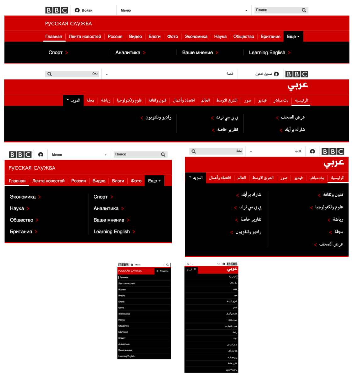
Using these three techniques we were able to build the BBC News site. Take a look at our bi-directional, responsive navigation:
8: Add additional break points for language specific issues
The verbosity of certain languages have always traditionally been a problem for multi-lingual sites. Russian is the example always given as it is on average 25% longer than western European languages, it very often requires more space to allow it to work in an interface.
Fortunately there is a nice synergy when it comes to multi-lingual web design and responsive web design. When done right, responsive web design is about designing interfaces around your content, adding break points into the design when the content layout starts to get weird. Because we are dealing with multiple edge cases already with responsive web design, we’ve found that this caters for much of the issues that multi-lingual web design presents us with.
However you will occasionally find that you need to add break points for certain languages to address minor layout issues. We call these break points “micro break points” as they do not affect the overall layout of the page (I think it was Michael Boulton who originally coined this phrase).
We’ve implemented micro break points targeted at specific services for issues that appear at smaller screen sizes. BBC Russian and BBC Chinese require these additional break points in the site name banner. Russian requires it because the service name is much longer than others, while the Chinese service has a button that allows users to switch between simplified and traditional scripts.
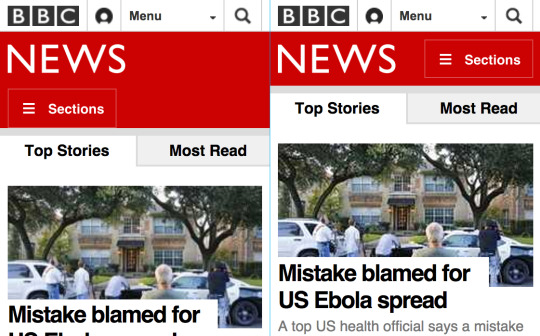
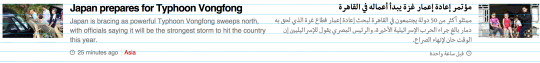
The English version of BBC News has a breakpoint at 281px that unwraps the section button
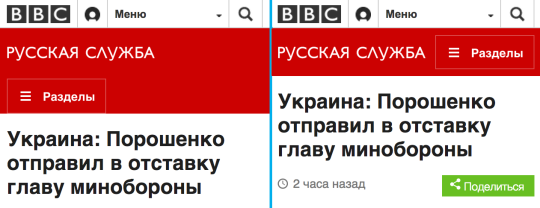
Because of the verbosity of Russian, the equivalent breakpoint happens at 316px
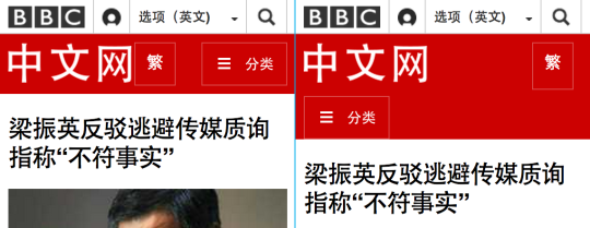
Chinese site title isn’t as long as Russian, but with the extra button in (to switch between traditional and simplified Chinese) the section button breakpoint happens at 286px.
We can add these breakpoints into our Sass files in an easily maintainable way using the services variables described in the tips above:
$breakpoint: 281px
if $russian {
  $breakpoint: 316px;
}
if $chinese {
  $breakpoint: 286px;
}
@media (max-width: $breakpoint) {
  ...
}
9: Make components adaptable for certain language issues
While we’re promoting the reuse of design and code across services, sometimes a service’s language will not work within the predefined confines of a language neutral component. We need to give certain services a level of customization for each component. Making a component’s design and code configurable allows us to achieve this.
The verbosity of Russian is a great example of this, it causes promos on index pages to be so large as to destroy the scan-ability of a page. Certain promos in the Russian service website will be rendered without the intro text, leaving just a title and an image. Our promo component has been designed to work with and without intro text. The template has been coded to conditionally not render the intro text when used in the Russian service website.
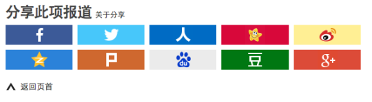
10: Localize social media buttons
Social media buttons are popular on websites and are obvious in their need to be localized. Different social media sites have differing levels of popularity around the world. While the likes of Facebook and Twitter will enjoy a large international userbase, they will be certain other social media services that are more popular or only exist in specific territories.
The BBC Chinese service is an extreme example of this, it has 10 different social media links.
When adding localization you can quickly make your templates become very complex. It’s tempting to add an if statement into the page to conditionally show certain bits of content. Or to even split entire files into two using an if with a trailing else block. Don’t do this, it’s bad practice, will quickly make your code unmaintainable and will anger Martin Fowler, the programming god of clean code.
With a modular design system you should also be building your interface in a modular fashion too. Break your interface into components, extract away edge cases into a components template file and allow the layout to be configurable.
A key tenet of programming is to make code extensible and yet also immutable. Translated into English for a non polyglot programmer to understand this means: build components that are very easy to extend, but the process of extending should not alter existing logic.
As an example let’s compare the different responsive layouts of the social media component on the BBC News website between the two services Arabic and Spanish.
This is actually two components: the share component and the share button (which we refer to as a “share tool”). This is what the rendered HTML looks like:
<div class="share share--lightweight show">
<a name="share-tools"></a>
<h2 class="share__title share__title--lightweight">شارك القصة <a href="...">حول المشاركة</a></h2>
<ul class="share__tools share__tools--lightweight">
<li class="share__tool share__tool--email">
<a href="mailto:?subject=...">
<span>ای میل</span>
</a>
</li>
<li class="share__tool share__tool--facebook">
<a href="http://www.facebook.com/dialog/feed...">
<span>فيسبوك</span>
</a>
</li>
<li class="share__tool share__tool--twitter">
<a href="https://twitter.com/intent/tweet?text=..." data-target-url="...">
<span>تويتر</span>
</a>
</li>
<li class="share__tool share__tool--googleplus">
<a href="https://plus.google.com/share?url=...">
<span>+Google</span>
</a>
</li>
</ul>
</div>
Notice the repeating li.share__tool element, this is the sub component. When rendering the social media component, instead of having the HTML within our template, we pass the URL to share and what social media buttons to render from our config into a sub template called share_component:
<%= share_component('www.bbc.co.uk/urlToShare', config.socialMediaButtons) %>
The sub template works like this:
<% function share_component(urlToShare, socialMediaButtons) { %>
  <div class="share share--lightweight  show">
    <a name="share-tools"></a>
    <h2 class="share__title share__title--lightweight"><%= vocab.shareTitle %> <a href="..."><%= vocab.aboutSocialMediaLinks %></a></h2>
    <ul class="share__tools share__tools--lightweight">
      <%
        socialMediaButtons.forEach(function (buttonName) {
          button_component(urlToShare, buttonName);
        });
      %>
    </ul>
  </div>
<% } %>
We could have just had the HTML from the share_component sub template in our main HTML template and add if statements around each button while checking the name of the service. But this style of coding would have become much harder to maintain and difficult to read. Making the component extensible using properties from a config file makes our code much more terse and easier to maintain.
240px is a good minimum width to start your designs from. This is the viewport size of entry level Nokia phones, it’s very unlikely you will have to support devices smaller than this.
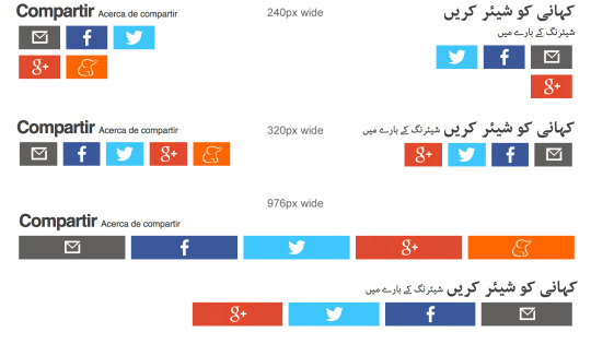
The social media component’s title has no break points associated with it, instead it takes advantage of standard line breaking behavior within the browser itself to add a line return at the right width regardless of what language we are using. Browsers are pretty good at laying out text so you should take advantage of this whenever you can. To make sure the link doesn’t wrap between each word, non-breaking spaces are used. Here’s the Spanish version to show you:
<h2 class="share__title share__title--lightweight">
Compartir
<a href="...">Acerca de compartir</a>
</h2>
The social media buttons have their width set to 25%, and then a break point is added at 320px to reset the width to 16%.
.share__tool {
  float: flip(left, right);
  width: 25%;
  @media (min-width: 320px) {
  width: 16.66%;
  }
}
Because each button is represented with an icon, no text is ever used so there is no need to apply different widths for verbose languages. Using just one break point, native browser behavior and some Sass syntax we’ve created a bi-directional component that is easily configurable for any language.
11: Don’t worry too much about iconography
Icons are interesting because their meaning spans languages, interfaces and technologies. We don’t localize any iconography in the responsive codebase, but we do test new icons to make sure they have the same meaning in all of our supported languages. You will be surprised by the universality of most icons. An example of this is the play icon found in video interfaces.

This icon is the same in all languages, even right to left languages like Arabic. In fact you’ll find that the entire video interface is always set from left to right no matter what market the website is for. The play icon points right and the video scrubber makes its way from the left side of the video to the right.
This is because of the way entertainment technology was adopted around the world in the 1980s. Walkman’s and video tape players were imported from America and Japan into the Middle East without having the interfaces adapted for those markets. Arabic users have learned how to use these interfaces and so do not require them to be switched.
12: Localize dates
When dates appear in body text you shouldn’t have to worry about the format. The author of the page will add dates correctly into the body as its part of the content. But certain dates on a webpage are added automatically without the assistance of the content curator. These can be dates like the page’s published date, or a release date for a film, someone’s birthday. Coming from the server or a value in a database these will be formatted in the system language and will need to be translated for each language site.
Date formatting for certain languages can look odd compared to what we’re used to in English.
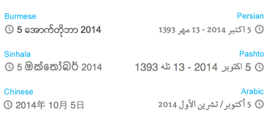
Here are some of my favourite peculiarities:
- The Chinese date format labels each part of the date, the example above reads “Day 5 Month 10 Year 2014”. Numerals are used in the Chinese date format because they require fewer characters than the Chinese alternatives. It’s convention to use numerals when displaying Chinese horizontally. When displayed vertically it is convention to use the Chinese characters.
- Though Persian and Pashto use different characters, they display both the Western calendar and the Iranian calendar together.
- Arabic shows two versions of the month name using a forward slash as a divider.
If you are going to be displaying dates then it is good practice to store it in a easy to parse format like UTC (Coordinated Universal Time):
2014-10-07T12:20:08+00:00
When rendering the date its good practice to take this value and parse it through a template dedicated to date formatting logic. Passing the UTC date value along with the service name and any vocab labels that are required:
<%= date('2014-10-07T12:20:08+00:00', config.serviceName, config.vocab) %>
The date template is going to hold all of your date formatting logic. This template will typically grow in size as you support more and more languages, or already be complex if you have to support many languages from the beginning. Instead of creating a large nested stack of if statements to place each language specific logic, a nice way to structure your code is to separate the decision of which language to format away from the implementation of that language.
By using dictionary look ups you can take advantage of a key programming principle of creating code that is extendable but immutable. Take this example:
<%
function date(date, serviceName, vocab) {
    var serviceDateFormatDictionary = {
        'english': 'dateFormatAsEnglish',
        'arabic':  'dateFormatAsArabic
    };

    return serviceDateFormatDictionary[serviceName](date, vocab);

    function dateFormatAsEnglish (date) {
        var dateElements = date.match(/^(\d\d\d\d)-(\d\d)-(\d\d)/);
        return date[4] + ' ' + date[3] + ' ' + date[2];
    }

    function dateFormatAsArabic (date, vocab) {
        var dateElements = date.match(/^(\d\d\d\d)-(\d\d)-(\d\d)/);
        return date[4] + ' ' + vocab['month-short-' + date[3]] + '/' + vocab['month-long-' + date[3]] + ' ' + date[2];
    }
}
%>
There are no loops or if statements in this template which makes reading and understanding this template very simple. Extending it for other markets is also obvious. If we were to add a “mundo” date format we’d make two edits: first we’d add a “mundo” entry into the dictionary JSON object at the top of the function; then we’d simply define the function that formats dates for the “Mundo” service.
13: Localizing content for specific services
Sometimes localizing a website for a service means making larger changes than simply adapting the formatting of components on a page or making sure components work in a bi-directional fashion. Some localized versions of your site could be significantly different to one another.
Localizing a website always means getting the balance between individuality and uniformity right. Sites do need to be customized, but if that customization is so extreme you may want to think about the opposite of what this blog post is about and split your codebase into two. There is no point trying to make two websites from one codebase. Different teams working to make different features with instructions from different stakeholders will eventually drive you mad.
However there is one last trick you can use to maintain a single codebase while also customizing your localized versions, and this trick makes the biggest difference.
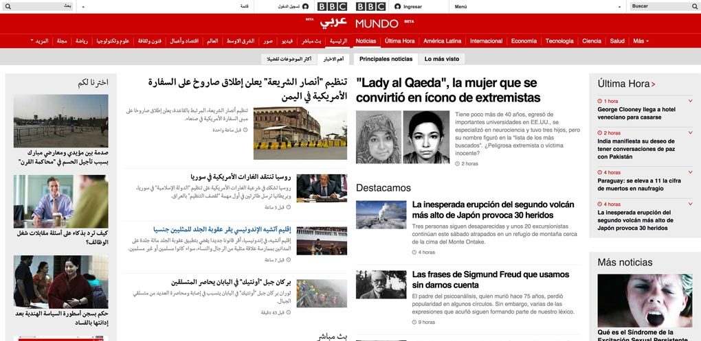
Not all of our sites have identical requirements or similar sized content teams. BBC Mundo publishes much content everyday, however this is mostly feature based stories rather than news.
BELOW: Blue highlighted areas are news, green highlighted areas are features. While news stories will always have precedence in the content hierarchy, there is more feature content.
BBC Nepali and BBC Somali broadcast a large amount of radio content, so the main objective of those sites is to promote this content rather than unique web content. The radio promo component is prominently displayed on the sites. BBC Gahuza meanwhile has a small editorial team and only publish about 30 articles a month.
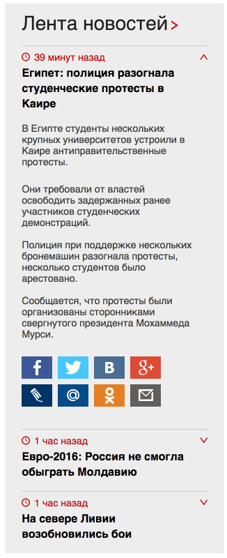
This difference in content publishing frequency means that the indexes of each service sometimes serve slightly different purposes. The Russian and Ukrainian markets like their news hard. They prefer constant, rolling news and frequent updates. Because of this we built a special component just for them, the “rolling news” component:
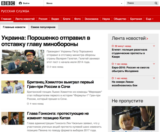
Each story in the rolling news component is readable and shareable.
Even though all of these sites come from the same codebase, because they have their own config file and we build our pages using a modular UI system, we can pick and choose what components each of their page types are made from. As much as I hate the analogy that you can build sites out of components just like you build Lego models out of bricks (ask me on twitter why I hate this), how we build all of our multi-lingual sites is very similar to this popular analogy. We’re able to quickly change the layout of indexes based purely on their config files, adding new components when they are needed. Because of this we are able to support a wide range of requirements from a single codebase.
Summary
Hopefully by now you should have some idea of how you can use these tips to help you create multi-lingual responsive websites. I may have painted a very nice picture in your head of the BBC News dev team, working harmoniously to effortlessly output 28 language websites from the same codebase. The truth is quite the opposite.
When we first launched in 2012 we were an English language site only. Our managers asked us to integrate the other 27 language sites into the codebase while also working on new features to give us content parity with the old legacy desktop site. It took a long time to get to where we are now, we had lots of issues trying to work out the best way of sitting in the same codebase together (News and World Service were originally separate teams). While we still have issues with our code we’re able to cope with them better because of the hard work and creative programming ability within our team.
I wasn’t involved in coming up with any of the solutions above, I’m just writing about them. We were lucky enough to have some outstanding people to work with, James Lee, Neil Doughty, Simon Sinclair (@thatsbyme), James Offer, @bogdandogaru, @st_belloro, @jamesmockett and @jakedchampion are just a few of the people involved in the work described above. If you’ve enjoyed this blog post and like what we share on responsivenews.co.uk then please vote for us as your Team of the Year in the up coming Net Magazine 2015 Awards. Thank you.
By @tmaslen
Additional reading: